Presenting Results
Results are a summary of statistical and analytical data that was collected to determine how well students achieved a particular learning outcome. Results summarize how successful students are in achieving goals and outcomes that are set by instructors, programs, colleges, and/or the university. Since results are a succinct explanation of data, individual scores or raw data should be reported in appendices, rather than in the results section, unless used as an illustration. All relevant results should be discussed in the results section. When reporting results, it’s important to discuss findings in detail in order to justify conclusions. When presenting results in assessment reports, choose the medium to display results that presents the results the most clearly to a variety of audiences.
Tables and figures, which include graphs, pictures, and drawings, are used to further support findings. Tables and figures display the most important findings. When using tables and figures in reports, mention them within the text of the report, and tell readers what information to they should look for in the tables/figures. Using tables and figures can enhance and simplify how you communicate findings in your assessment report.
Tables are useful in providing exact values and presenting complex results and an analysis of your findings.
Figures, which include, bar graphs, line graphs, pie charts, pictures, and drawings, are visual interpretations of the results. Figures help when comparing data and illustrating relationships in data.
^^Back to top
Types of Data and Analyses
Nominal Data
This type of data is named-only, or categorical, data. Nominal data is not associated with numbers and there is no concept of degree or order (e.g., one category being higher or lower than another). Nominal data simply separates information into different categories.
Analysis: It is not appropriate to perform any arithmetic operations on nominal data (such as calculating or comparing means). Frequencies and Percentages of the number of cases that fall into each category may be the most appropriate type of analysis for nominal data.
Example: Certain demographic information, such as race/ethnicity/national origin, is nominal. For this type of data, you might report the number and percentage of people that fell within each category:
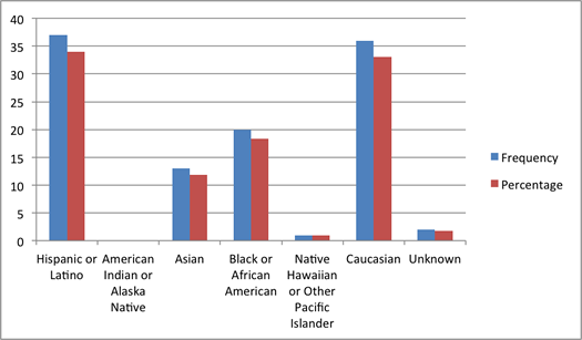
Nominal Data Example 1: Frequences and Percentages Reported in a Table
| Race/Ethnicity |
Frequency |
Percentage |
| Hispanic or Latino |
37 |
34.0% |
| American Indian or Alaska Native |
0 |
0.0% |
| Asian |
13 |
11.9% |
| Black or African American |
20 |
18.3% |
| Native Hawaiian or Other Pacific Islander |
1 |
0.9% |
| Caucasian (Non-Hispanic) |
36 |
33.0% |
| Race/Ethnicity Unknown or Prefer Not to Report |
2 |
1.8% |
Nominal Data Example 2: Frequencies and Percentages Reported in a Graph
Ordinal Data
Ordinal data specifies an order to the information. However, the amount of space or distance between data points are not fixed or known. Scale points from a survey instrument are an example of ordinal data. For example, strongly agree is known to be “higher” than agree, but the distance between agree and strongly agree is not known.
Analysis – Like categorical data, ordinal data does not meet the assumptions necessary to perform arithmetic calculations on it (such as calculating or comparing means) and the most appropriate type of data analysis may be calculating frequencies and percentages for the data points. If you do choose to calculate means for ordinal data, it is important to understand how violation of the assumptions affects interpretation. For example, a mean of 4 cannot be interpreted as twice the mean of 2, since the distance between data points is neither equal nor known.
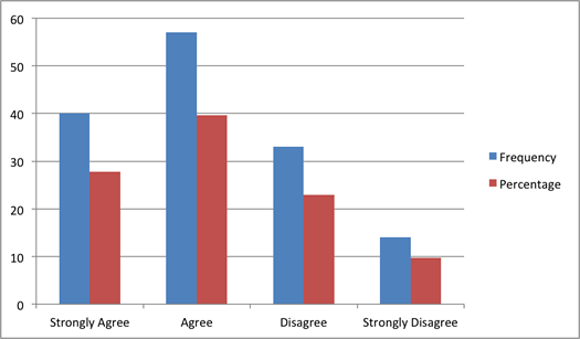
Ordinal Data Example 1: Frequencies and Percentages Reported in a Table
| Agreement |
Frequency |
Percentage |
| Strongly Agree |
40 |
27.8% |
| Agree |
57 |
39.6% |
| Diasgree |
33 |
22.9% |
| Strongly Disagree |
14 |
9.7% |
Ordinal Data Example 2: Frequencies and Percentages Reported in a Graph
Interval Data
Interval data specifies an order to data with equal, fixed, and measurable distances between data points. An example of interval data is temperature. The difference between 20 degrees Fahrenheit and 30 degrees Fahrenheit is the same as the difference between 30 degrees and 40 degrees. However, interval data does not have an absolute zero (or zero indicating a complete lack of something). In the case of temperatures on the Fahrenheit scale, zero does not indicate a lack of temperature.
Analysis – Interval data meets the assumptions necessary to conduct certain arithmetic operations, such as addition and subtraction, on it, but still violates assumptions to perform multiplication or division. As in the example for ordinal data, this is because without a meaningful (or absolute) zero, a score of 4 will not necessarily mean double a score of 2. However, if you are careful in not interpreting data in this way, use of any arithmetic operation may be justifiable. Possible analyses may include measures of central tendency (such as calculating mean, median, and mode), measures of distribution spread (such as variance or standard deviation), measures of relationship (such as correlations or regressions), or mean comparisons (such as t-tests or one way analysis of variance).
Examples – Scores on a test may be interval data if the difference between a 90 and 95 is the same as the difference between 95 and 100 or between 80 and 85. However, scores on a test would not be considered ratio data (see below) because a 0 on the test would not necessarily indicate a complete lack of knowledge on the subject matter or learning outcome.
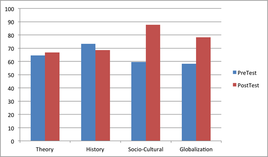
Interval Data Example 1: Mean Test Scores Reported in a Table
Average Test Scores:
| Domains |
Test Items |
100-Level Courses |
Capstone |
| Theory |
1, 4, 9, 11, 15, 20, 25, 29 |
64.52 |
66.73 |
| History |
2, 7, 12, 15, 22, 28, 30 |
73.26 |
68.54 |
| Socio-Cultural |
3, 5, 8, 10, 13, 14, 18, 24, 27 |
59.63 |
78.31 |
| Globalization |
6, 16, 17, 19, 21, 23, 26, 27 |
58.29 |
78.31 |
Interval Data Example 2: Mean Test Scores Reported in a Graph
Ratio Data
Like interval data, ratio data specifies an order and fixed interval between data points. However, ratio data has a meaningful (absolute) zero, or a zero point that indicates a complete lack of whatever is being measured.
Analysis – Ratio data meets the assumptions necessary to conduct any arithmetic operation on it. Possible analyses may include measures of central tendency (such as calculating mean, median, and mode), measures of distribution spread (such as variance or standard deviation), measures of relationship (such as correlations or regressions), or mean comparisons (such as t-tests or one way analysis of variance).
Examples – Assessment of student learning rarely, if ever, includes the collection of ratio-level data. Some examples of ratio data include height, length, and time.
^^Back to top
Scoring Guides
An important consideration in planning an assessment project is determining how you will measure students’ achievement of the learning outcome you are measuring. Scoring guides provide a shared structure for and definition of how student work will be judged. It is critical that a scoring guide is tied directly to the student learning outcome it is measuring.
Examples of Common Scoring Guides
-
Rubrics
- Structured Observation Guides
Structured observation guides are a more qualitative type of scoring guide.
Advantages
- They allow for richer descriptions of student performances or work.
- They may be useful for the assessment of qualities that are difficult to operationally define, like attitudes or values
Disadvantages
- This is a more subjective approach to scoring.
- It is more difficult to analyze results than quantitative methods of scoring.
Example of a structured observation guide for student presentations
| Effectiveness of presenter |
Notes |
| Communicating purpose of presentation |
|
| Organizing the presentation |
|
| Demonstrating knowledge of topic(s) |
|
| Speaking with clarity |
|
| Responding appropriately to participants’ questions |
|
| Adhering to time constraints |
|
| Accomplishing the stated objective |
|
References
APA Style Handbook, 2001 p. 20-21
^^Back to top